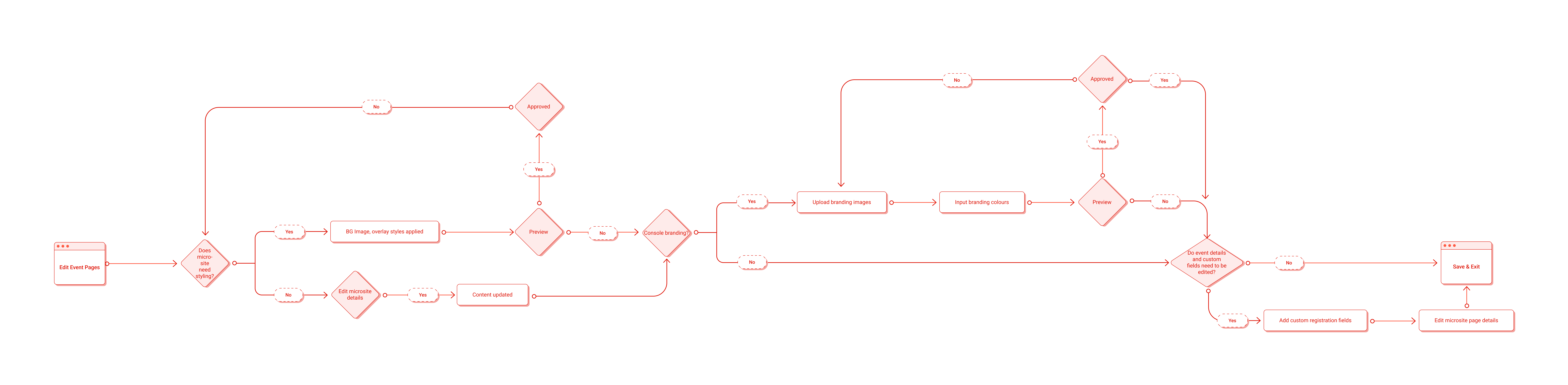
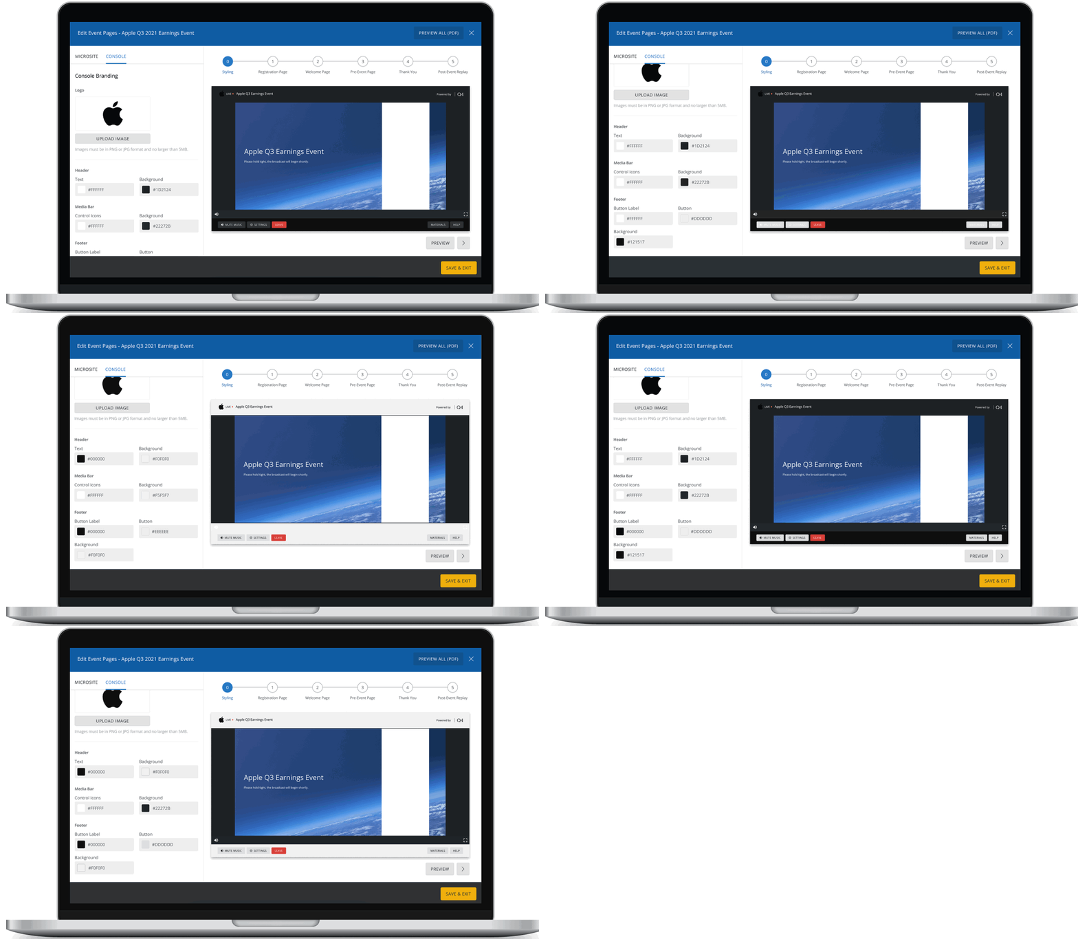
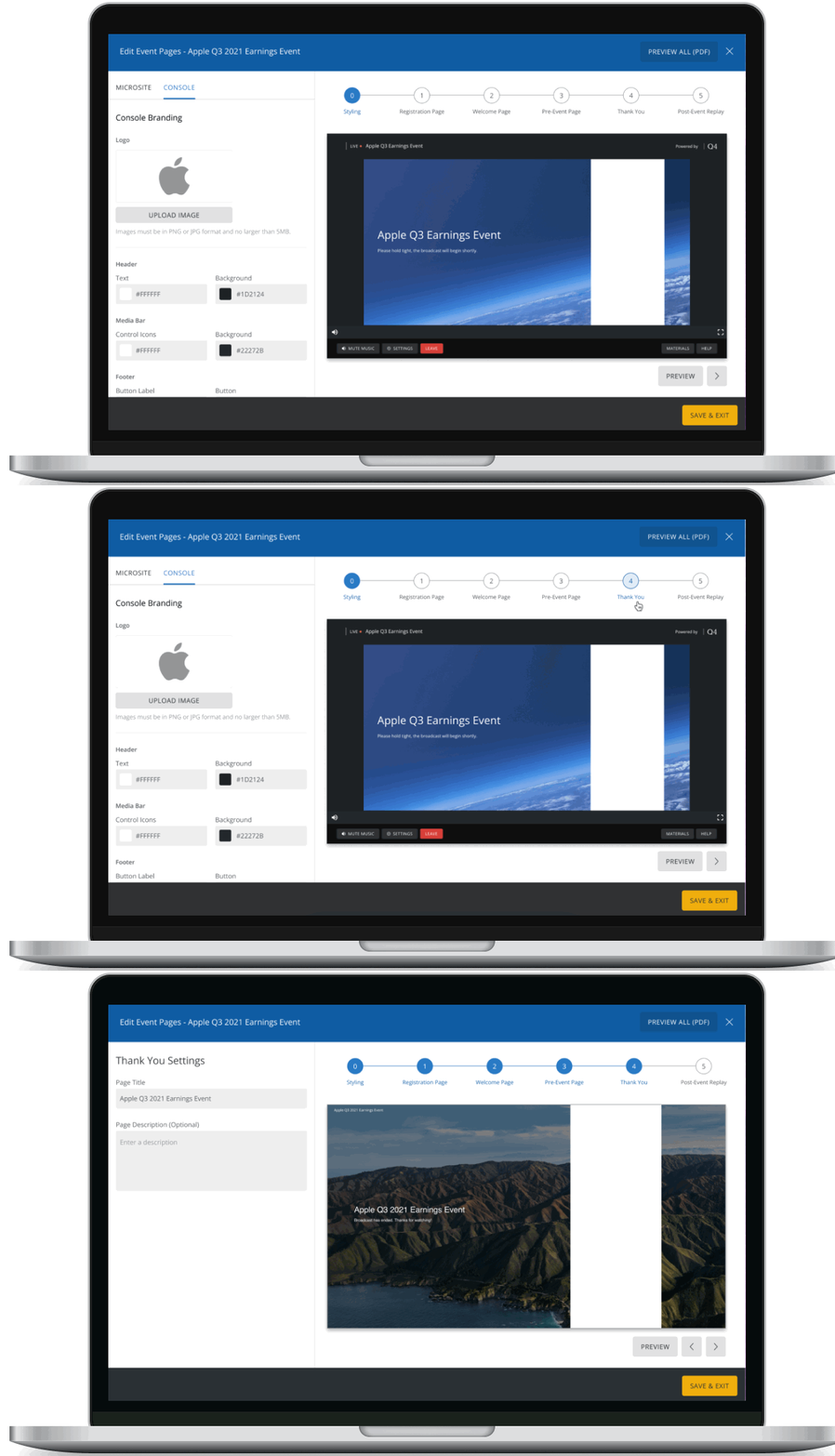
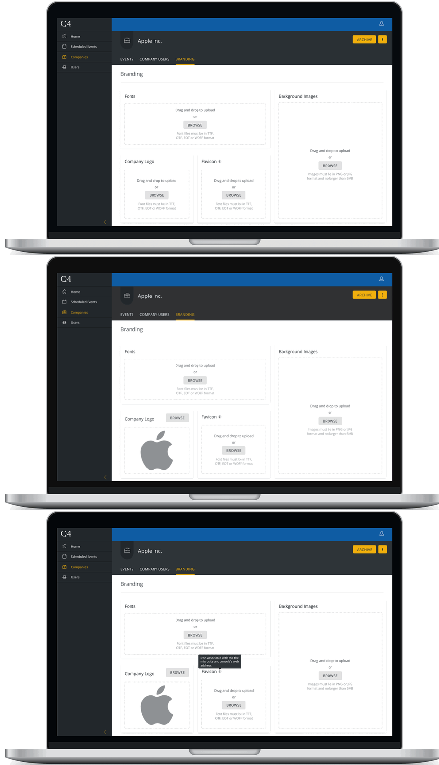
From there, I jumped into rapid lo-fi sketches, exploring how to lay out the interface and interactions without focusing too much on the visual language. I focused on key questions such as:
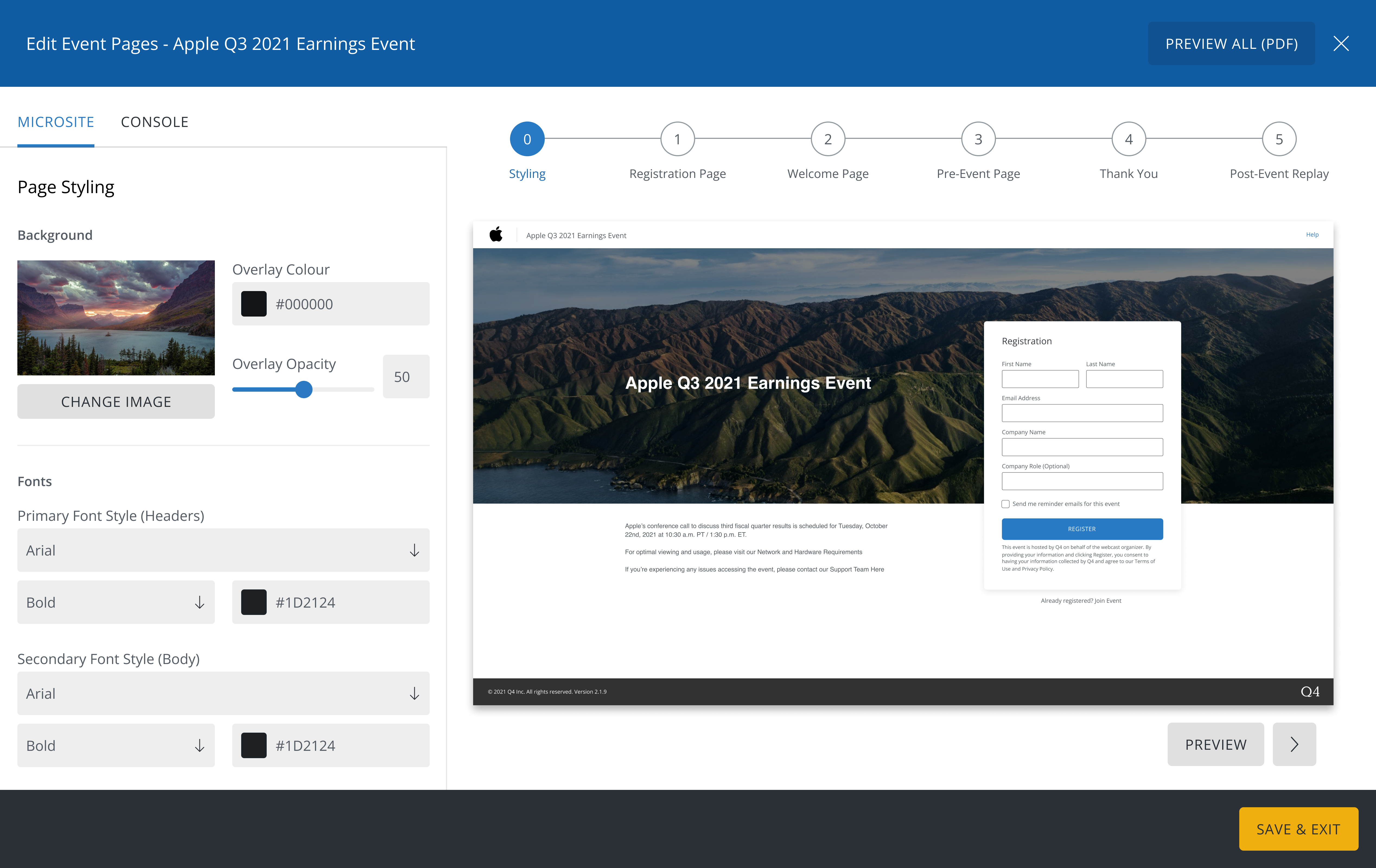
- Should the editing experience mimic our existing registration page editor for consistency, or would a different interaction pattern be better suited for this feature?
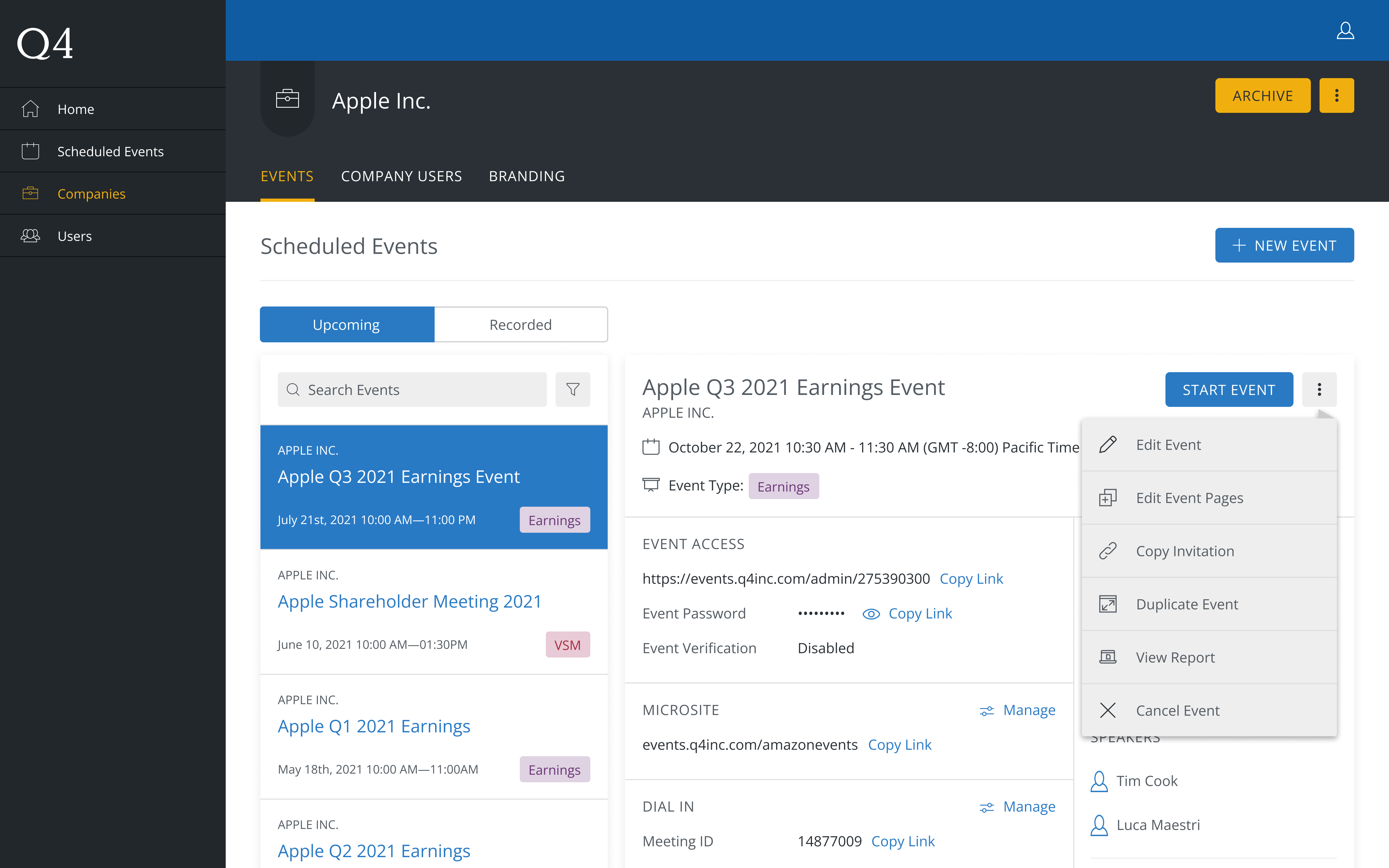
- Where (under the existing Events Platform) might users expect to find the branding editor?
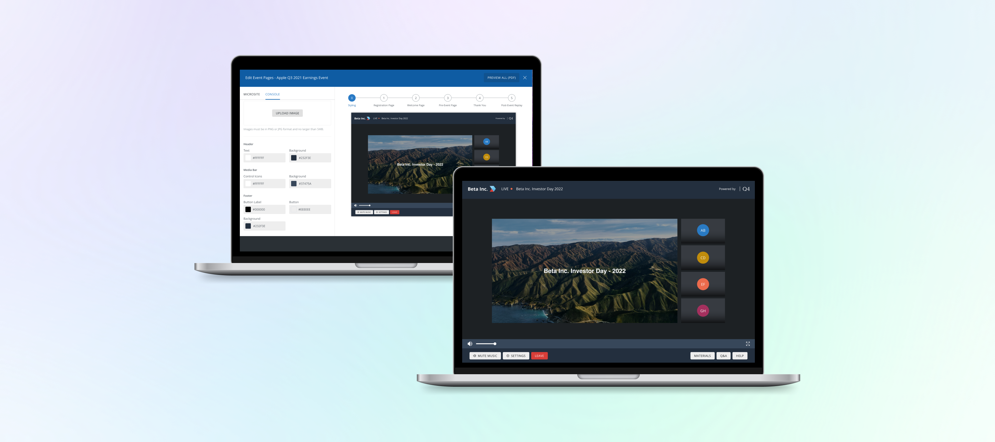
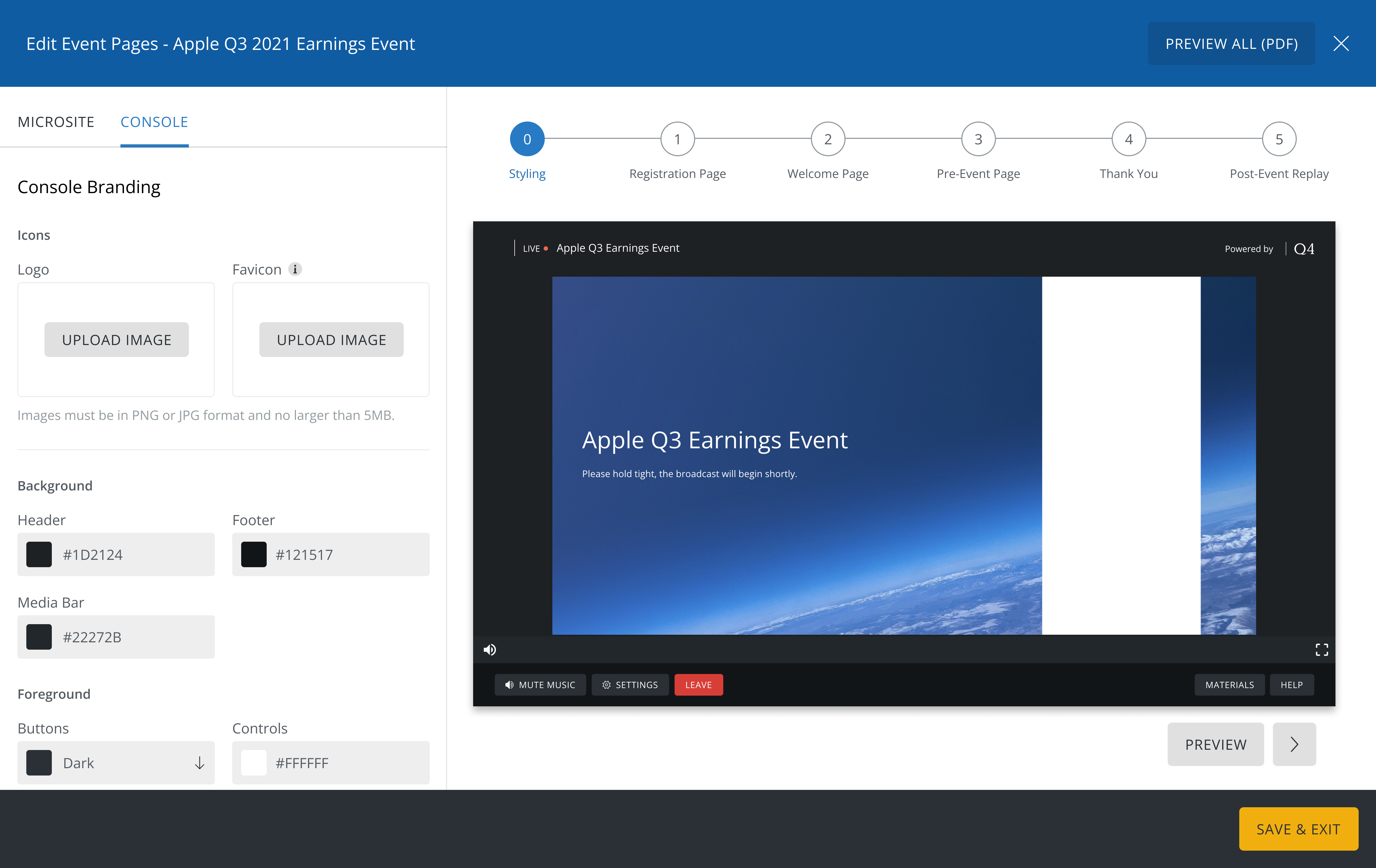
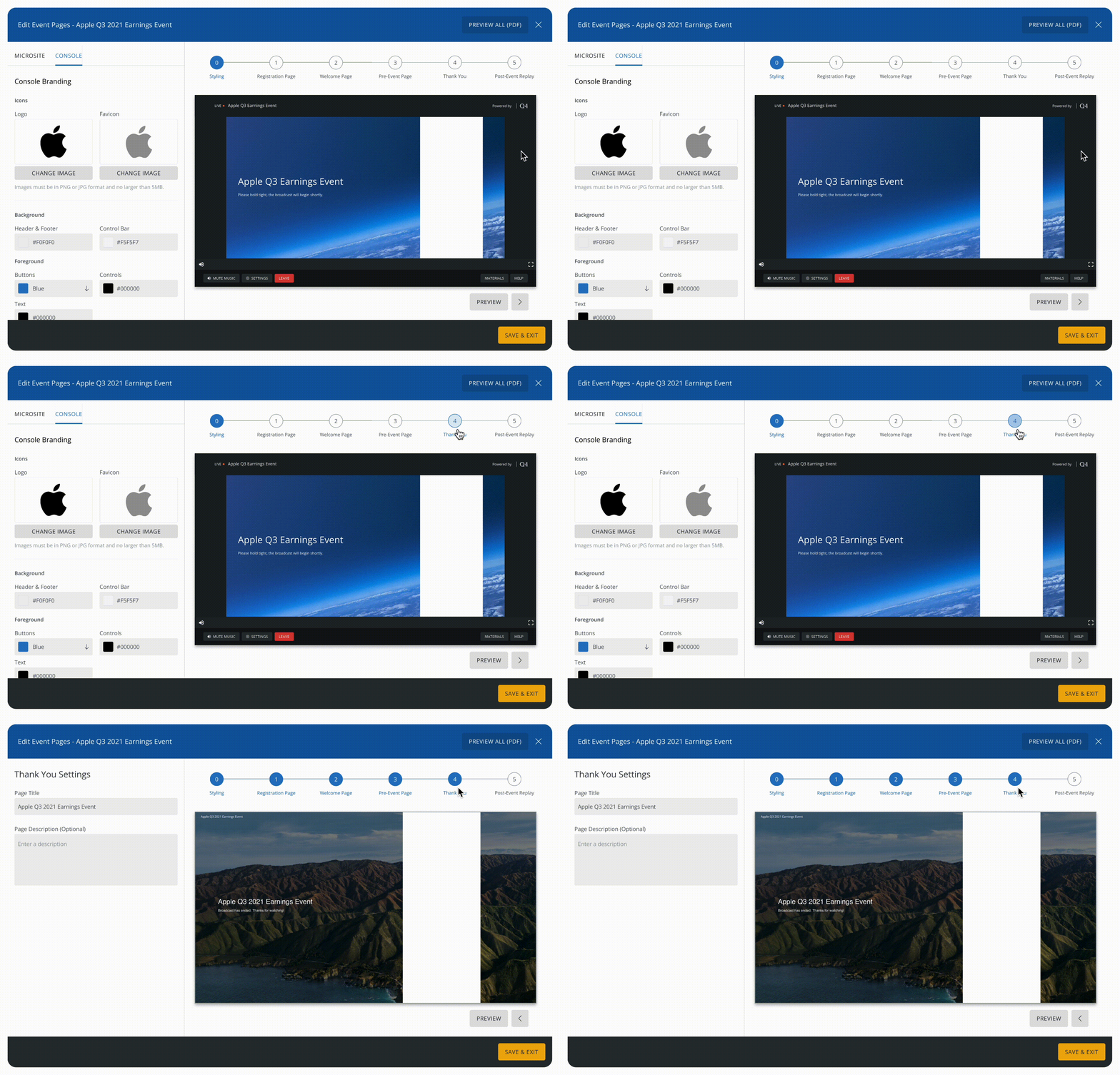
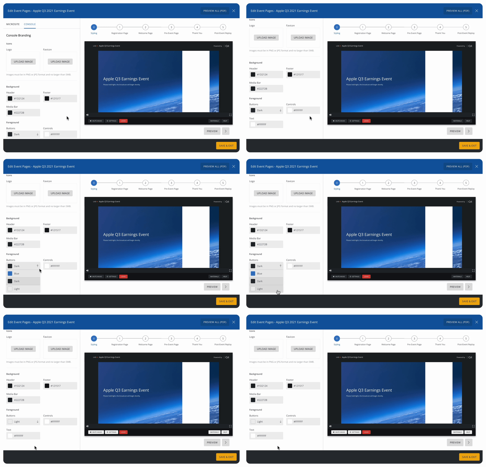
Once I had enough clarity, I created mid-fidelity prototypes to use for usability testing. This prototype focused on the layout, interactions, and how branding elements such as logo uploads, colour pickers, and background images would function in context.