To compete with top trading platforms, OANDA prepared to introduce cryptocurrency trading to its long-time Forex users. While competitors had a head start, our strategy focused on mobilizing loyal customers already familiar with our ecosystem.
Users were hesitant to engage with new offerings that felt like starting over.
I started by mapping out design goals, possible assumptions to validate, and questions I needed answered.

Three rounds of quick mockups were created to figure out the general direction of the visual language and layout for this new product offering.
Users overlooked the information on the crypto service due to competing actions and information on the main dashboard.
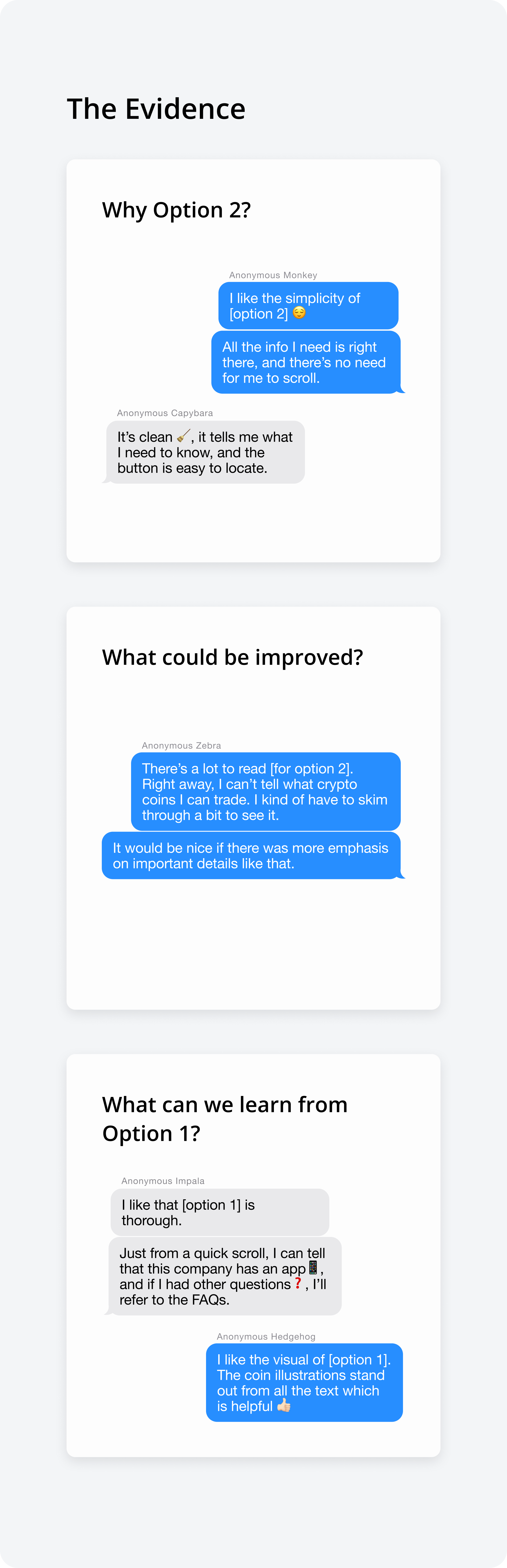
"I feel like there's too much going on within this page already. I probably wouldn't notice it, or think it's an ad."
The CTA copy "Continue didn't provide enough clarity on if the crypto account would be a separate account or if it would be connected to an existing one.
"Am I signing for a completely new account? I'm not sure how this affects my existing OANDA account."
Two layout options were explored. CTA copies were changed from "Continue"/"Create" to "Activate" to clarify that crypto accounts would be activated within the user's existing account.
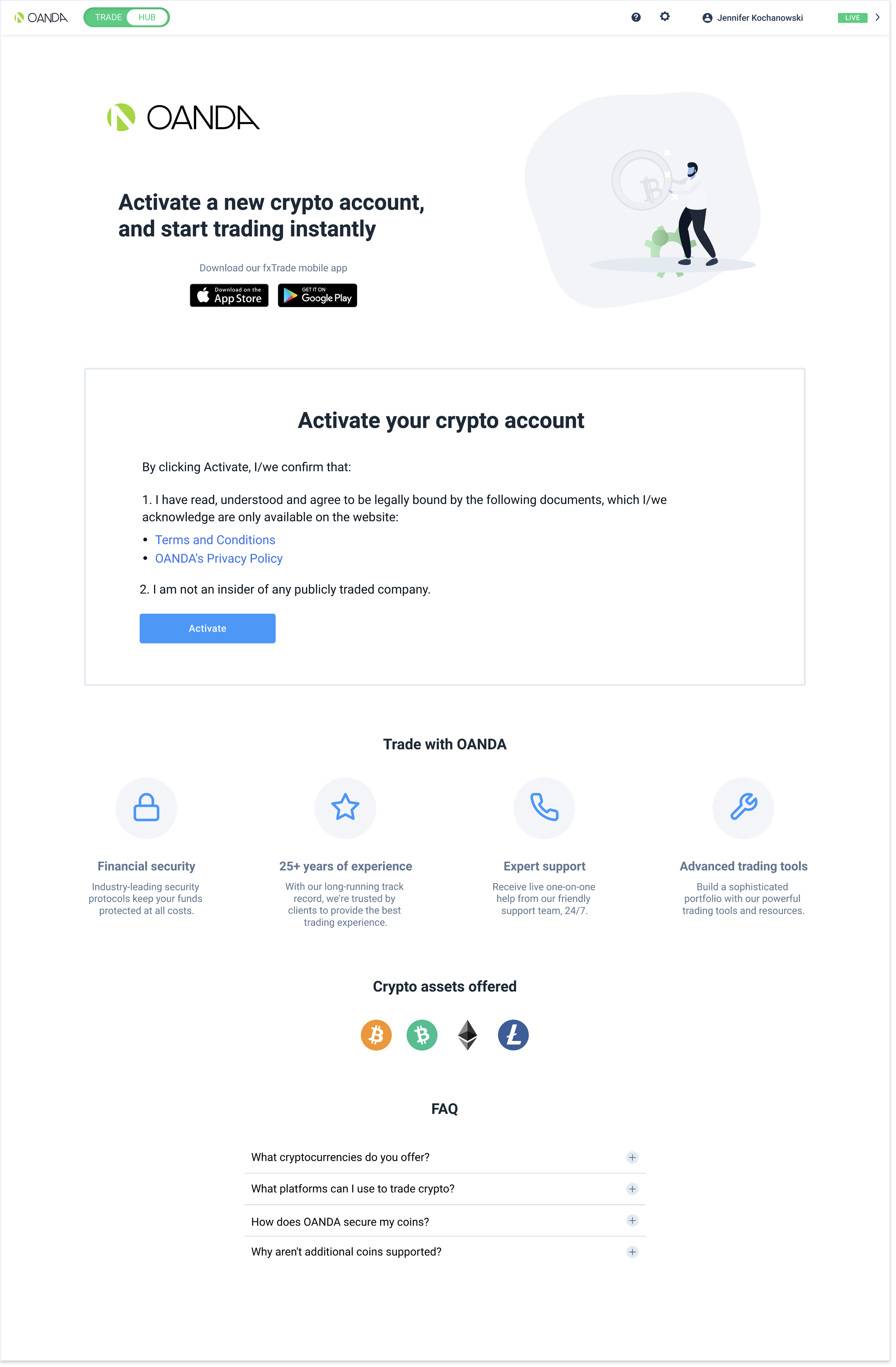
The vertical layout presents a variety of detail and graphical elements, while the horizontal layout is cleaner and condensed.
Using the final two iterations, I ran A/B tests on usertesting.com, with screened participants that were well versed in forex and crypto trading. They were asked to share their screens and think aloud.
Testers expressed a preference for option #2 (horizontal layout) due to its simplicity, but some expressed concerns about its visual appeal. Notably, they found that the page lacked emphasis on fundamental details like the types of coins offered, which would prevent them from activating an account. Option #1 (vertical layout) earned favour for its use of graphics and icons, which guided users to key information—a quality absent in the second option.